Showing posts with label Raji Radhakrishman. Show all posts

My favorite rooms at this year's Kips Bay Show House

There are many stunning rooms, if not all, in this year's Kips Bay show house but I have three favorite rooms that I can literally live in.  In last year's show house in the Hamptons, one of my favorite rooms also belonged to Rija Radhakrishnan, a designer who not many bloggers knew about and this year she again stunned me with a room she designed with a special client in mind.  Another one of my favorite rooms this year is also designed by a designer I had never heard of before.  Alexander Doherty's room "A Collector's Bedroom" was paneled in washed oak and the private collection of art display in the room is to die for.  I was completely smitten with the entire decor of the room that went from the pop of red in the Robsjohn Gibbings sideboard to the touches of brass and the spectacular selection of custom made furniture.  If you are not new to this blog, or if you are, you should know of my eternal love affair with sculptural furniture.  There is no easier way to go chic with your decor.   (personal note:  get some oak paneling even if they're fake)
1940's sunburst chandelier.
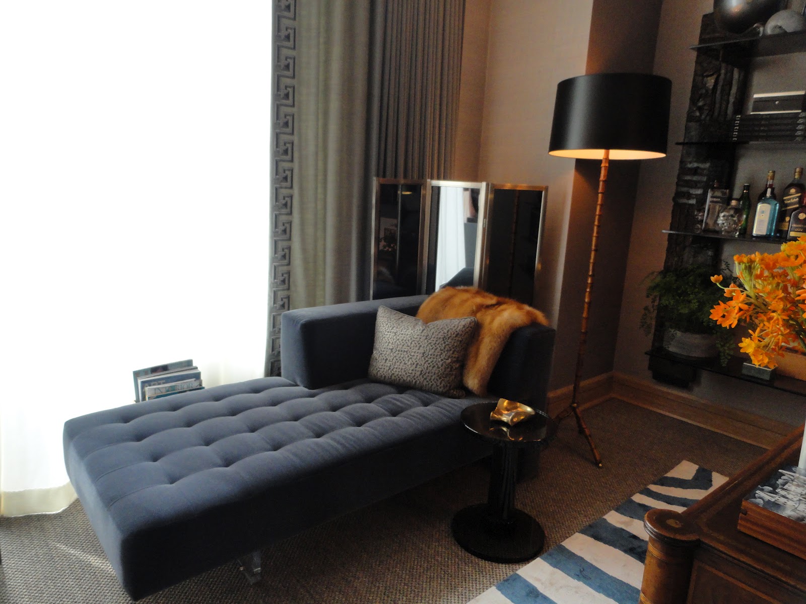
The Gentleman's Study designed by David Scott was breathtaking.  David played with contrast at its best.  The space was masculine but it could fit a lady's taste as well.  David told me he was inspired by his new book and also that he wanted to design a space like he would design it for himself.  And for me, I would say if you ask.  David's space also has oak paneling on one wall and Seagrass wallpaper on the other where the amazing Paul Evans bookcase is.  The bookcase is from Todd Merrill.  
Custom made omnibus chaise lounge by Vladimir Kagan Couture, the floor lamp is by Jacques Adnet.
George III writing desk
Kubrick console by Mauro Fabbro, moon wall sconces by Stephen Downes, the sculpture is by Paul Evans from Todd Merrill. The blue chair is by Jean Royer and is from Maison Gerard.  
David's book Outside The Box is one book I can't wait to buy.  The images are great and if you didn't know, David is a curator interior designer so I'm sure there is a lot he can teach to those who want to learn. 
Stunning!
"Le Bureau Prive" was a home office designed by Raji Radhakrishnan for her imaginary client who was none other than the chief curator of Metropolitan Museum of Art.  Raji blew up a painting she took from the Metropolitan Museum and used it in the back wall of the sofa.  A very traditional image but used in a very modern way exactly like a museum curator would want to live, I suppose.  The walls were treated with a Venetian plaster technique, remember what I said here?  Adore how the throw on the sofa makes it look as if it were upholstered in two different tones.  The desk chair is by Jules Leleu from Maison Gerard and the amazing sideboard and pyramid are by Laverne.  The photograph above the mantel was taken by Raji and then blown up.  She put it up on the wall the same way she did in last year's Hampton's show house.   

The red zig zag table, a reference to Albert Hadley, is by LeavittWeaver.  Hadley used this type of table in few of his projects, you can see here
The desk chair is by Jules Leleu from Maison Gerard.
Laverne bar cabinet and pyramid.

All photos by Julie Yenicag for Belle Vivir

Hampton Designer Showhouse 2011; My Favorites

We're back home and had a wonderful time at the Hamptons and while there I visited the Hampton Designer Show House.  By the way, it has almost the same layout as the 2009 house.  I was thrilled and happy to find that many of my favorite rooms featured, very interestingly the same natural palette.  Many people think only about blue and white and then blue and white when it comes to decorating a beach house. Though if we look in the bottom of the ocean, it happens to be more colorful than the outside world actually.  Or even when looking at shells we can find all different types of colors ranging from black to light beige and many shades of pinks.  We collected many shells while walking on the beach, my husband loves to do that!  It occurred to me then, that many of the rooms I liked were in these shades of color and that's why I wanted to pair them next to each other to see how well they represent each other respectively.  My favorite room in this year's showhouse was, hands down, the dining room, designed by Robert Stilin.  I was so impressed with the exquisite and unique selection of furniture that I forgot to take all the pictures I wanted to of this room.  Robert used French furniture from the 30's and 40's (my favorites) leaving the chairs in their natural old upholstery.  The chair that you see in the far right corner was magnificent, I sat on it and it was so comfortable!  The walls were upholstered in a graish/brownish seagrass and the clear textured linen shades softened everything up.  This room may appear to many as a little bit masculine but I think it was more neutral than anything else.  I think this room would appeal to a young millionaire CEO who is very forward minded. 
I took a picture of this lighting fixture below and I really felt like taking it down and just run out with it. 
My second favorite room, hands up and down again, was Salon des femmes designed by Raji RM Associates.  Again because of the selection of furniture.  Raji Radhakrishnan also chose, from what I can tell, transitional furniture from the 30's and 40's and everything looked just perfect.  So eclectic and rifined, this room made me want to have it as my personal space.  This is definitely a room I would use as a sitting area in my master bedroom and enjoy my everyday afternoon coffee.

I adored the idea of gluing the poster directly on the wall which was framed by the center boisserie.  I love the sconces.  I think a chic room, as this one is, should have some tension and modernity hence the shape of the rug.  A room that is entirely classic and traditional cannot be chic!
I understood the use of the shag rug on the lucite chair but I didn't prefer it.  I would actually have opted for a completely different type of lucite chair. 
The french pottery below were adorable and the lamp spoke to me so eloquently.
The powder room below designed by Tilton Fenwick was just fun and lively.  I really loved it.  The pop of red against of the green and black wallpaper was just brilliant!! Below is an image found online of a coral mixed with seaweed.   Isn't that combination just gorgeous!!  The same color scheme found the this powder room. 
Below are the images of the Guest room which was designed by Keith Carroll.  I was very interested in studying this room because even when I didn't love the wallpaper everything was pulled off so well.  Which is in essence what a well designed room should feel like.   The combination of purples, browns and yellows were very soothing and cozy.
 I loved this cozy seating area in the room. 
The Guest living room was designed by Eddie Lee and I really loved the color scheme also.  This room was in blue, pink and earth tones all in a pastel scale.  I adored the sectional sofa!
One of the bathrooms was designed by Meg Braff and the palm wallpaper was very Palm Beachy.
This vignette by Haus Interiors was very boho chic!
I also enjoyed the very interesting and unique artwork throughout the house as seen below.  How smart and unique.
Whenever I have a beach house I have to get one propeller and use it as art.  This one was used by Meldenson Group on the upstairs landing.
Another uber-cool art used in the second floor of the pool house.  Designed by Brady Design.  What kid wouldn't like to have an ice popsicle as art?
I think that this men's dressing room in the master bedroom (below) designed by The Paint Palette would look great as a country home foyer.  Don't you?
All images are taken by me with the exception of the proppeller (material Girls), second image of Raji Radhakrishman's room by My Notting Hill.