Showing posts with label House Beautiful. Show all posts

A very much personal house: Michael Formica home

It's a brand new week and it's been uninterruptedly sunny here in Sao Paulo for the past week, hurray!  So even when I'm a little bit under the weather, thanks to my son, nothing makes me more happy than a bright sunny day!  I love to wake up early in the morning do some home-related errands and get the "what's for cooking" out of the way and start working early.  Work on my coming-soon print line and on my some-day-will-happen bijoux line.  High five to the modern women who can be more than just one or two things.  Actually, lately women are starting to hate labels or Bios, they have come to realized that they can be too many things at once.  I include myself in that group.
In another note, my sweet in-laws brought over from the US the House Beautiful December/January issue for me to see my humble contribution in it but I kept hanging on Michael Formica's home.  What pedigree, what personalization and what a beauty!  I love that home like many people love their dogs or cats!  Enjoy the beautiful images!
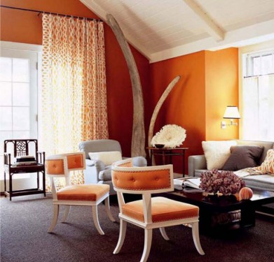
The first room above, Julian Schnabel watercolors sit above and John Dickinson plaster side tables frame the sofa.  An Isamu Noguchi side table and a rope chair by Marcel Wanders accentuate the very personalized feel in this living room.  This room is very warm and earthy. 
A very organic and industrial feel surrounds the fireplace.  Annabelle Selldorf's wall lights guard the beautiful Nakashima wood sculpture.   I adore the small sculptural accessories above the mantel. 
More collection pieces.  John Dickinson pine table and Billy Baldwin coffee table among other modern pieces.
Another view of the living room found at Elle Decor Designers registry.
This kitchen is a great example of good thought put into design.  Ikea kitchen mingles with designer pieces such as the Frank Gehry's table.
The foyer above.  Below, Another view of the foyer.  Found at Formica's website. 
 The bedroom above is possibly my favorite in this house.  The upholstered walls make this room so alluring and Frenchy.  It's not busy at all because of the saturated images in a Grisaille tone.
Photos scanned by me and the sources mentioned.

Thank you House Beautiful! Images yet to be seen

 A beautiful and cozy room designed by Kevin Isbell in the December/January issue
I'm happy to have been contacted by House Beautiful to write a post on Grass Cloth a week ago and very honored for the mention and link that will appear in the December/January issue.  If you have an iPhone you'll be able to link to Belle Vivir through the HB Connect app.  (correction Android phone users can download an free app called Digimarc Discover).  It's amazing how dynamic and personal magazines have become.
House Beautiful was kind enough to send me the article so I can see it and new watermarked images that will appear in the December/January issue.
Kevin Isbell knew how to make this1930's center-hall colonial home current by injecting warm and intrinsic details such as geometric trims to floral curtains, gross-grain ribbon tape to a plain white sofa and visually connecting two separate rooms by custom painting grass cloth walls the same color as the ceiling.  "Grass cloth has a warmth that paint does not, and darker colors are more cocoon-like" Kevin Isbell.  
I absolutely adore the contrast between the modern looking cocktail table and the wicker basket in the family room.  Notice the detail of the tape on the sofa.  It's all in the small details that slowly reveal themselves to you.  In this room the grass cloth used is a bit more textured than the one used in the bedroom above.  A very applicable difference, I think.
You know how I feel about any klismos and klismos influenced chairs, right?  It's forever my favorite chair.  And the contrast here between the lilac slipcovered chair and the leather brown on the klismos chair is the perfect union of masculine and feminine.  I didn't want to spoil the article so I'm only posting the three images above, the two below are from Isbell's website.  As they prove, he really knows how to cozy things up.  Enjoy!
 Top three watermarked images exclusive from House Beautiful, last two from Kevin Isbell website.

The Versatility of Grasscloth wallpaper

 
I said it before and I'll say it again, the versatility of grasscloth wallpaper is indisputable.  It adds coziness and texture to a bare wall almost instantly while the natural fibers provide a home with that perfectly imperfect patina.  I have used grasscloth wallpaper a few times in different projects, including my home and its easiness to either glam up or glam down a room never fails to surprise me.  In the second image below, the use of white washed wood, lush fur throw and seagrass wallpaper make the entire ambience glamorous and velvety.  
Long gone are the days when this type of wallpaper would only be available in solid colors.  Now you can find them with all types of hand printed patterns.  Ideal to take it all up a notch!
 Below, my powder room.
first four images via House Beautiful

Kitchen of the week: Kichens with TVs

Many people have a sort of TV aversion.  Kind of like the TV will slowly morph into their brains,  brain wash them, and wake up the next day as an even worse person.  Let's not forget that BALANCE! is a very, if not the most, important word in life.  I'm even guilty of turning it on and keeping it on while I work from home sometimes.  We all have an annoying friend who does not shut up but we don't want to live without, that's TV for me.  It keeps me company a lot!
TVs in the kitchens are loved by children and maids (hello soap operas) in countries where house help is affordable. Enjoy!
Herringbone floors and a minimalist kitchen island= perfect for a bachelor.
I'm not sure if this is a TV in this kitchen but it looks like one. 
I love the red in this kitchen where the TV is attached to the upper cabinets.
A glam kitchen also needs some company.

Home Design Trend: Paint Technique

 The living room done by Carrier and Company had a very subtle and delicate linen technique.
Up until a couple of years ago the word "paint technique" would make many, including myself, freak out!.  The first thought coming to mind would've been that weary sponge paint technique of the 90's that was just eekie-cheapi-looking... Now wall paint technique have refined itself to the limit.  Most of the designer showhouses I've visited lately have had many walls covered in these new and exquisite techniques.  The latest was Designer Visions Showhouse 2011 where basically all three apartments had two or more rooms covered with Ralph Lauren's paint techniques which offer a range of finishes from Natural Linen to Antiqued Leather.  My favorite finishes so far are Natural Linen and Venetian Plaster.  Now this last one may not appeal to everyone but I think that in modern apartments where architectural details are lacking, this would add interest and character.
In the den, Carrier and Company applied another linen technique in an orange tone where you can appreciate the effect better.  Below, a closer look.
This decorative paint done on the entryway of this year's Designer Visions Showhouse is Venetian Plaster and was done by Ricardo Brizola.  The same technique, below, was done on the hallway walls of Elle Decor Modern Concept home this year. 
images via House Beautiful, Casa Diseno,

Something Blue + Giveaway

No, this isn’t another wedding post!  The publishers of House Beautiful’s latest book “Blue – 350 Inspiring Ways to Decorate with Blue” sent me a complimentary copy to review (and will provide a copy to one lucky reader!)

HB Blue. Cover

I love the House Beautiful books which are a collection of images from the magazine supported with ideas and advice from interior designers .  This one has to be my favourite thus far.  

DSC02025 

Decorating with blue is timeless, versatile, appealing and  a fail-safe choice when decorating.  I realized that I have included some of  the images in the book in previous blog posts.  See here, here and here.

The book shows how blue can work in any room and with any colour scheme.  This bedroom decorated by Tom Stringer in a navy and white colour scheme is bold and fresh.

HB BLUE. Page 179 

While this bedroom with a muted blue and orange scheme is more tranquil.  Designer John Willey points out that “the orange isn’t too bright because it’s printed on tan linen rather than cotton.”  And by cotton he means a white ground – good tip! 

HB BLUE. Page 207

This is one of my favourite images from the book, in part due to the gorgeous blue textiles but also the idyllic setting. Le sigh…

blueHB1new

Would you like to have this book as part of your collection?  The publisher has kindly offered a book to a reader.  To win:

* become a Follower of Decor Happy by clicking on the Follow button near the bottom of the sidebar and

* leave a comment letting me know if you have any blue in your own home.  If you don’t have a blog, please leave your email.

For extra entries:

* tweet about the giveaway linking to this post and including @vanessajfrancis in the tweet

* follow me on Twitter

This giveaway is open to residents of Canada and the US. I will choose a winner using random. org on May 19th.

Good luck!

Words of Wisdom

HBMaycover

Editor in Chief Stephen Drucker’s column in the May issue of House Beautiful is full of “big advice” and I just had to reprint it in its entirety. Love that he didn’t want to “waste a page” by saying his goodbye. Mr. Drucker is a big supporter of design blogs, so I’m sure he won’t mind if I reprint this.

“No object in a room should wink at you (thank you, Billy Baldwin). Always group things in odd numbers. Beware of using more than two pairs of anything in a room. You never really know what a mirror will do until you hang it. Never, ever paint an entire room until you’ve lived with big sample boards of three possible colors for 24 hours. Pick your paint colours last. Pick your kitchen floor first, before the cabinets. When you’re not sure what color throw to buy, remember, you can’t miss with chartreuse. Beige rooms are beautiful in sunlight but can die at night. If you’re afraid of sitting on it, touching it, or breaking it, get rid of it. Don’t try to use too many ideas in one room. Don’t fall into the trap of believing that any one piece of anything is going to “make” your room.”

Stephen Drucker

Wasn’t that great advice? Decorating 101 in a dozen sentences.

Congratulations Mr. Drucker as you begin your new position today at Town and Country where I’m sure you will continue to inspire and inform your readers.

I’m Feeling Blue (in a good way)

There were two reasons I was excited to receive my March House Beautiful in the mail yesterday. First of all, I usually receive my US subscriptions weeks after they have been on the newsstands, so to receive a March issue in January made me smile. The second reason was the issue was all about the colour BLUE, which is a favourite colour to use when decorating not just my own home, but clients’ homes as well. Erin of House of Turquoise gets a mention in editor in chief Stephen Drucker’s column. Way to go Erin!

pendantHB

I love the use of blue in this dining room especially the slipcover fabric on the chairs – Jasper’s Indian Flower in Blue.

blueHB

Gorgeous glass tile described by designer Marshall Watson as “periwinkle verging on cobalt.” It’s a kitchen in Fire Island, New York which is 5 miles out in the ocean so careful consideration had to be given to the building materials. For example, the walls are all wood (not drywall) which breathes and bends in a storm. That’s what I love about this magazine – the insight from designers as to the design choices they made.

blueHB2

Great idea – 1” x 6” blue glass tiles lining the perimeter of the bathroom near the ceiling. Love the mix with the 12” square wall tiles and the hexagon floor tiles.


blueHB7

This room has three things I love – round mirrors, branches and subtle wallpaper (see earlier posts). 

blueHB4

Although I don’t think I would personally do a patterned sofa and rug, there’s something about this room that says come on in, sit and stay a while.  An artist painted the nautical chart of Long Island in the “map room” – how unique is that?

blueHB5

I love the bookcase painted in Farrow and Ball’s Down Pipe which looks very gray on the paint chip but quite blue in this photo.

blueHB6

Now that I have done yellow and blue posts, I think red will be next, don’t you?