Happy Friday! Today, I’m sharing a friend’s kitchen makeover that I helped with (just a little!)
First let’s see the before. I give you Exhibit A (totally stole that from Margot, by the way)…
It’s a typical standard builder kitchen from about 10 years ago. She did upgrade the counters to Corian at the time and the greyish colour she chose still works. The layout was working for her and and there weren’t a lot of options anyway. The bulkhead couldn’t be removed – boo!
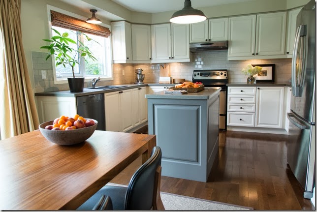
Here’s what M did to not only update her kitchen but ensure that it will stand the test of time and still look great in another ten years.
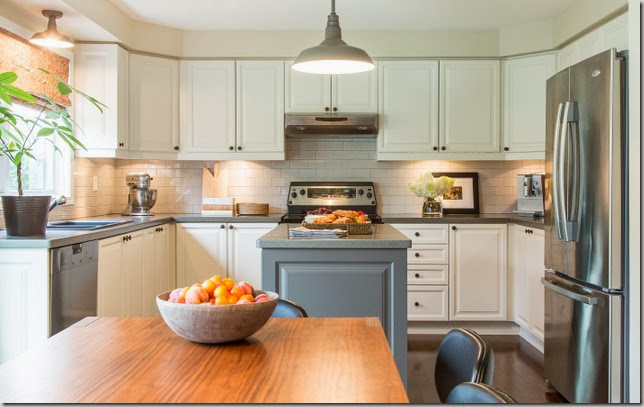
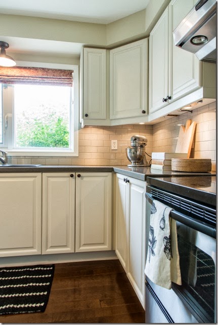
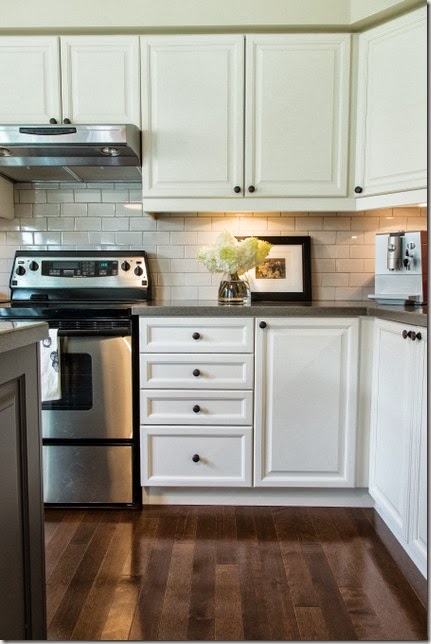
1) When in doubt, paint it white. Her cabinets are a classic style so there was no need to replace them. They were painted Benjamin Moore CC-50 White Down. Paint it Like New is a great resource for painting cabinetry. I have mentioned them a number of times on the blog and I am using their services right now to paint a vanity. I would leave painting cabinetry to the professionals.
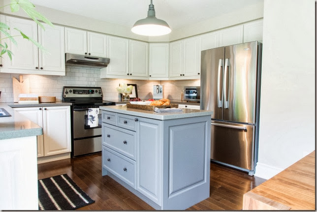
2) Paint the island a darker colour to ground the space. She used Benjamin Moore CC542 Willow.
3) Add end panels to the sides of unfinished, plain gables like M did here on her island and to the left of the dishwasher. Really fancies things up.
4) When you have a bulkhead, choose a wall colour close to the cabinet colour or the bulkhead will be highlighted which you don’t necessarily want. She used BM HC 81 Manchester Tan.
5) Replace dated lighting. M used these pendants from Restoration Hardware in 3 different sizes (you can’t see the very large one over her dining table.) I have always been a fan and they add just the right amount of industrial cool.
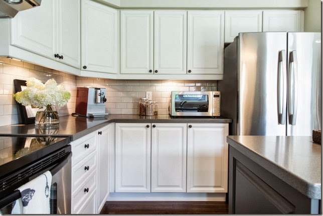
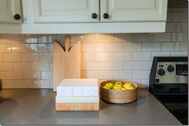
6) Change the knobs/handles. M used these bronze knobs from Lee Valley which ties in with other elements in the adjoining room.
7) Add a backsplash. I’m a huge subway tile fan but to kick them up a notch M used these light grey ones. This was the very first tile we chose – M searched again at several places and came back to this one. Always happens!
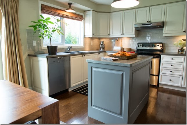
8) Update your tired dining table and chairs. I love the plank table and leather chairs from Up Country – wish I had a better pic to show you. On one side of the table is a bench.
9) Add undercabinet lighting and a valence for task lighting which also highlights the backsplash.
All photos (except the before) by Leah Kirin.
10) The last update is a costly change but so worth it. The dated 12x12 ceramic floor tiles were replaced with yellow birch hardwood. M has noticed how soft it is on her feet compared to the tiles.
M also replaced her sliding patio door with a luxe one from Pella – you can’t see it in the photos though but trust me, it is gorgeous. She still has a few things she wants to do in the kitchen like replace her range and hood fan and her drapes.
I think she did a terrific job (with a little help from a friend)! Do you have any tips for updating a kitchen without doing a full blown reno?
Happy Thanksgiving weekend (Canadian friends)!
If you require design advice, please contact me at vanessa(at)vanessafrancis.com.


